Bay to Breakers Mobile App
Reimagining content from a 9 page .pdf into a mobile app in Figma.
Opportunity
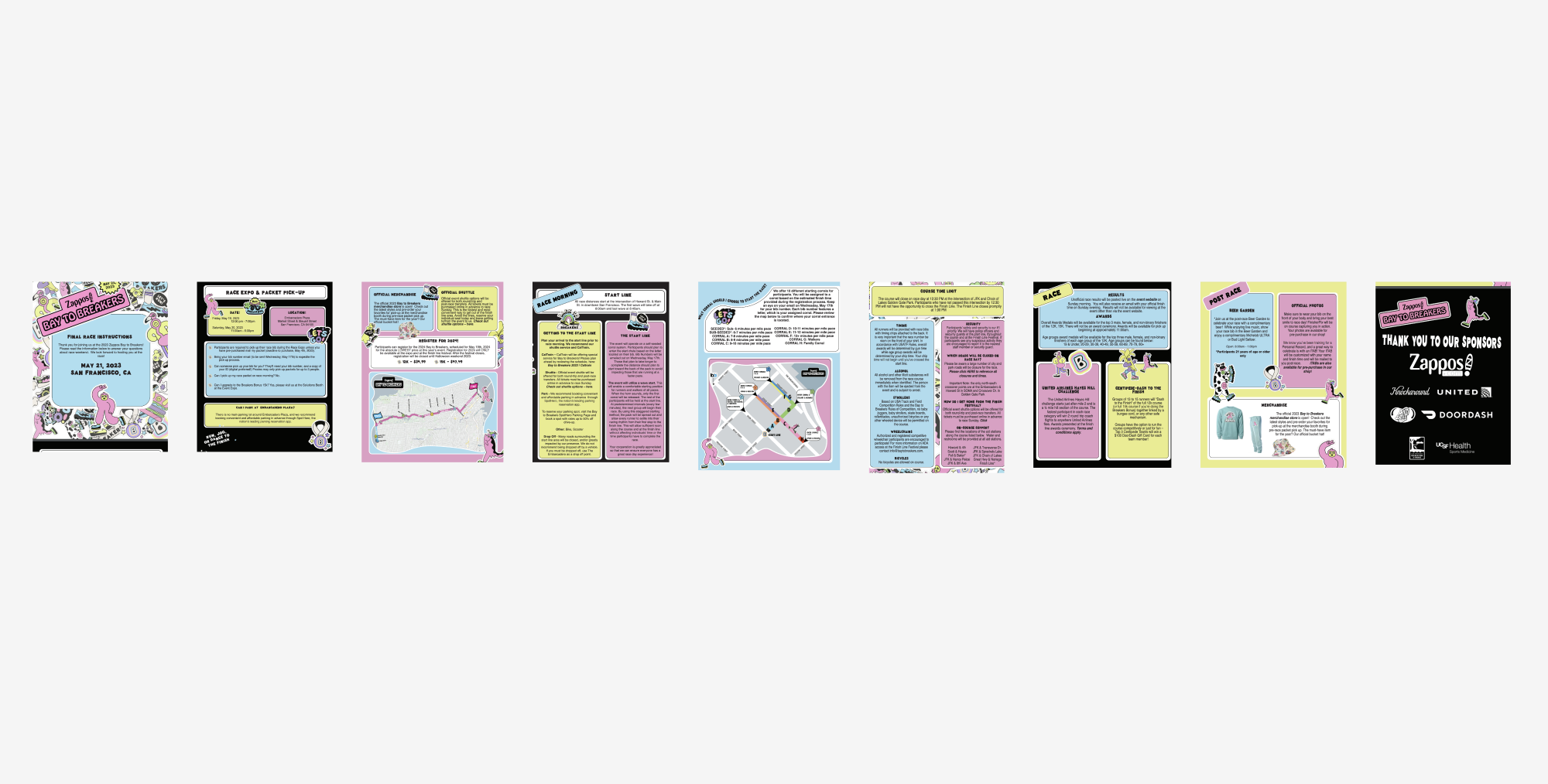
Bay to Breakers began with a nine-page PDF filled with dense, repetitive, and difficult-to-navigate information. For an event defined by movement, energy, and thousands of people navigating San Francisco, a static document wasn't designed for the moment when participants needed it most. I saw an opportunity to transform the information into an experience that could move with them, so I created a mobile app to house all of the information.
Branding
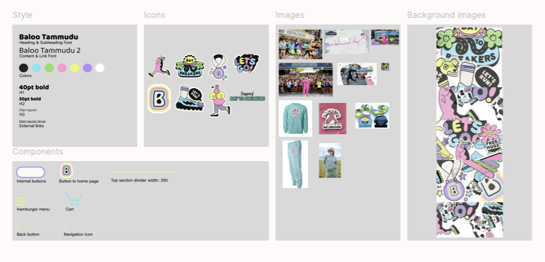
I actually started here. I really enjoyed the original branding of this race and it kept me excited to design more. The colors, the font, the “stickers”… it was all well done and did not need reinventing. Through several Google searches and font searches, I found components needed to keep the bright and fun branding alive in the new app. I created a mini branding guide within the Figma file to help keep the visual style consistent as I worked through different solutions for the content.
Strategy
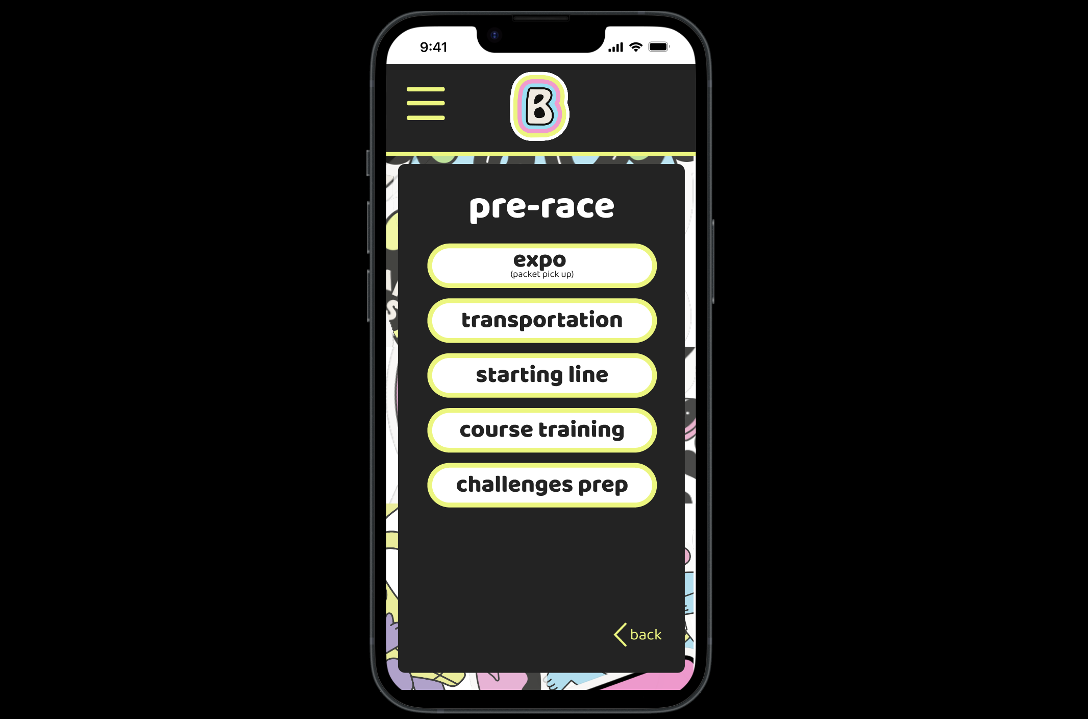
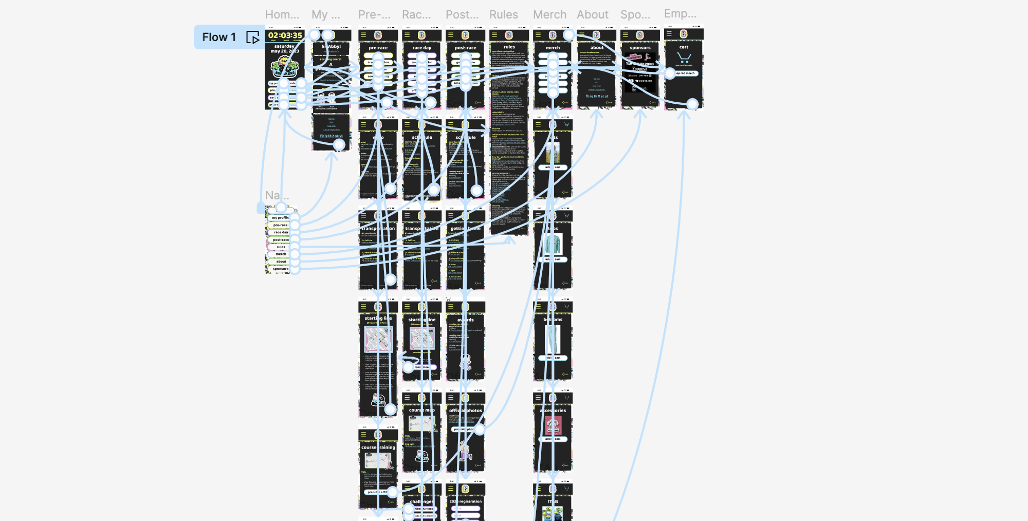
Instead of simply translating the PDF into a mobile format, I reimagined the experience around the participant journey. I organized the content and functionality around three distinct moments—pre-race, race day, and post-race—turning a collection of information into a purposeful tool that could anticipate what participants would need at each stage of the event.
Design
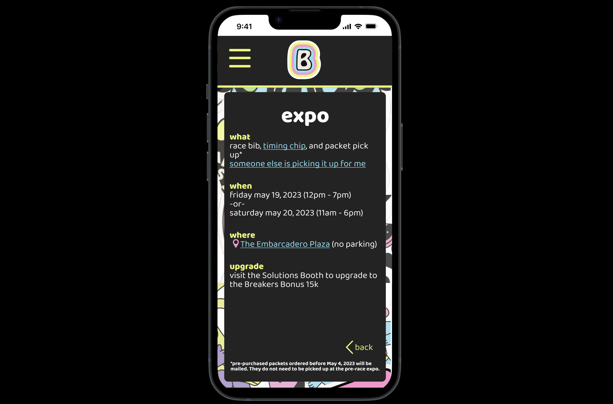
I redesigned the experience as a mobile app and created the prototype in Figma. Information was streamlined and reorganized for quick, contextual access, while new features extended the experience beyond the original content. Participants could drop a pin to share their location with friends, browse event merchandise, and easily access ride share options when the day was over—whether they were heading home from an after-party or simply ready to call it a day.
Outcome
The result was a more intuitive and useful event experience that replaced information overload with guidance that was timely, relevant, and actionable. The project demonstrates how content design can move beyond organizing information to identify unmet needs, shape product experiences, and create value through thoughtful UX and content strategy.
A video walk-thru of the app is also available upon request.
